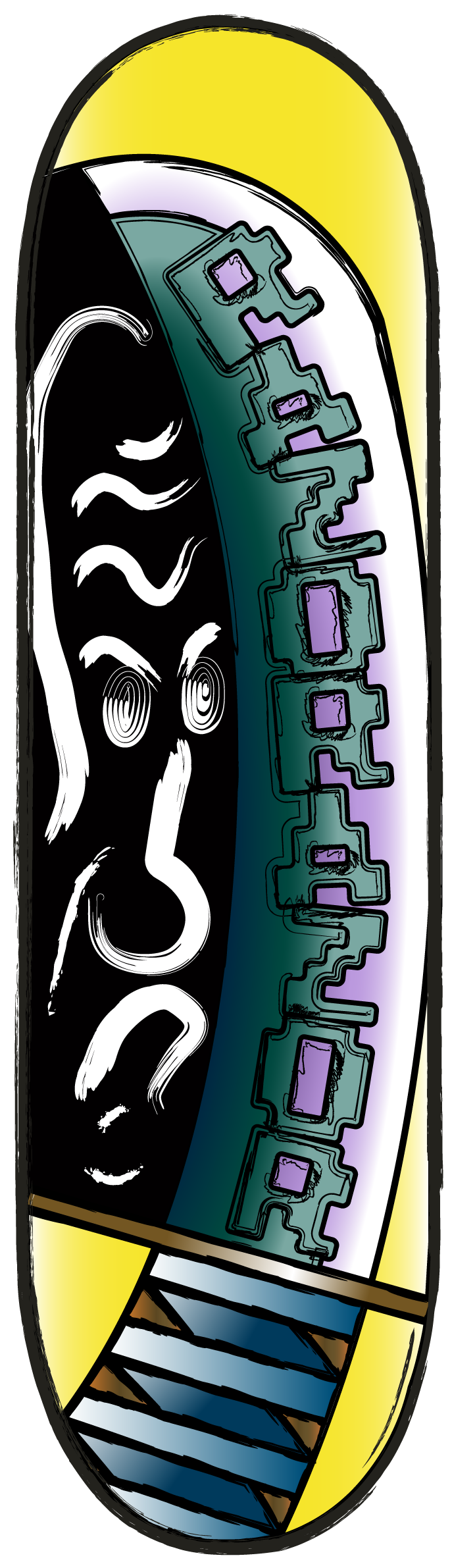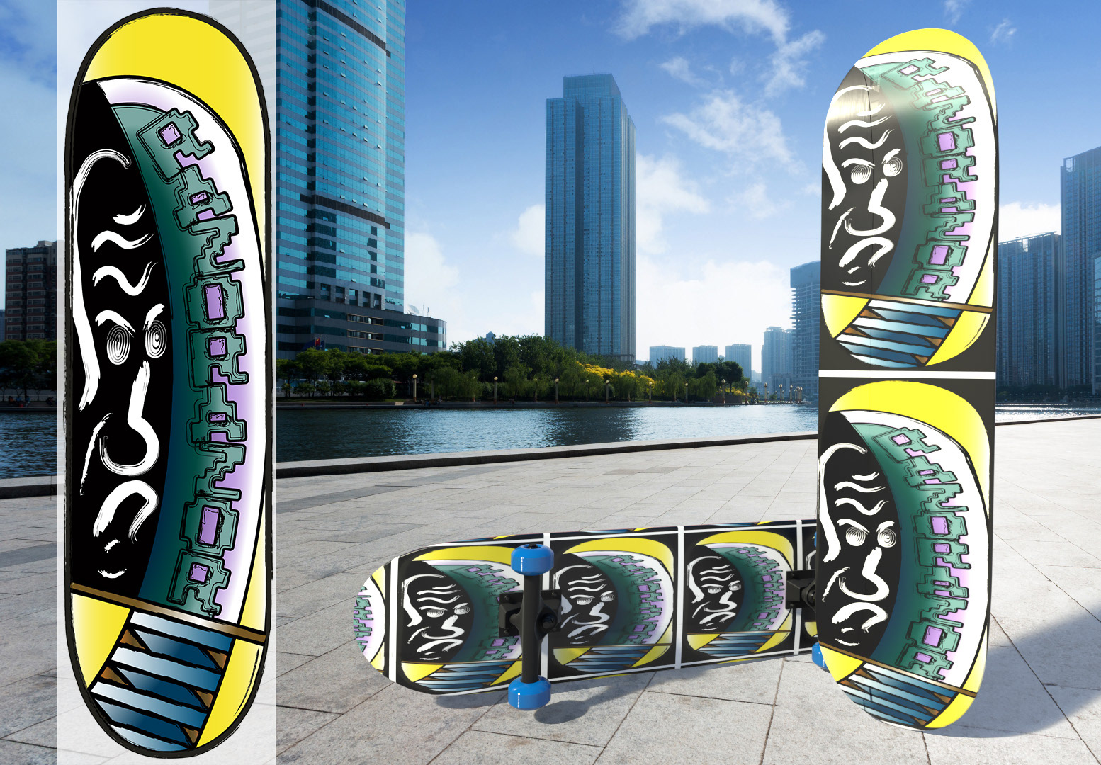
There was a contest to design a skateboard to be featured in an upcoming Tony Hawk game, so I challenged myself to make one! In the end, I didn't enter the contest because I wanted to put more time into the final design. Spent about 3 weeks playing with different directions and details to get the final version of (drum roll please...)
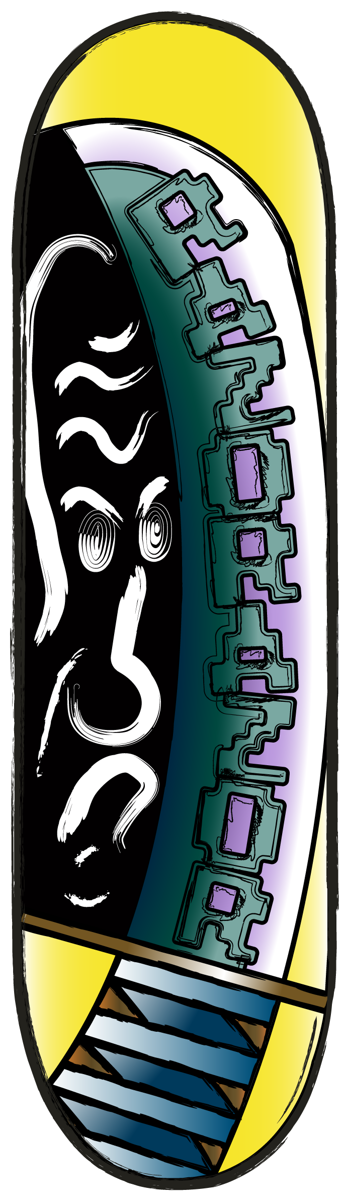
Ol' Razorazor!
Ol' Razorazor!
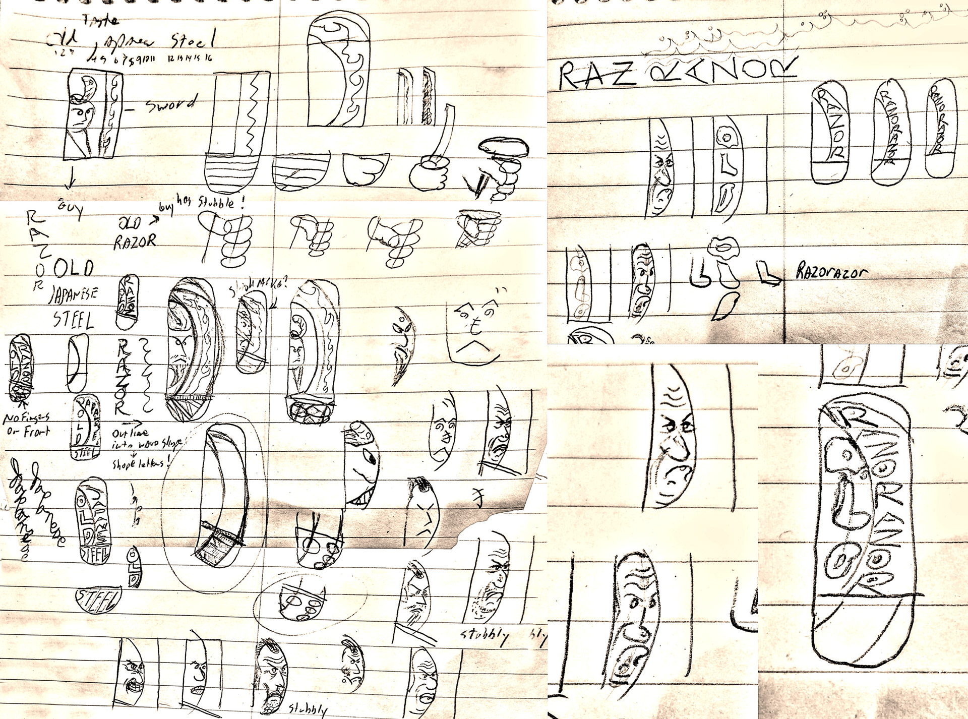
I love old Japanese Chanbara (swordplay) films, and title of one in particular, called "The Razor", sprang into my mind. That set me in the onto the basic direction of making something featuring a samurai with his sword. For the sword, I played with how much of it to include in the design. The most beautiful part of a Japanese sword, for me, is the Hamon (forge pattern on the blade). I experimented with making the Hamon look like fire, ocean waves, and even making it from letters.
For the samurai, none of versions in which he was young and cool looking grabbed me. Then it hit me... what if he was an older version of the samurai from the movie? An old razor! Something about the idea of a young and rebellious skateboarder riding around on a board that featured a disapproving old guy made me laugh. Then the design started to look like an old man's face painted on someone's stomach and I laughed some more. Either the old man or the sword could be the true old razor, so I doubled up and named it "Ol' Razorazor".
Now off to Illustrator!
Now off to Illustrator!
1
2
3
4
5
6
7
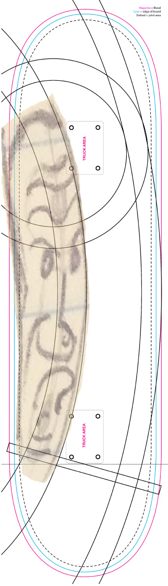
In Illustrator, I went through several iterations of pulling things from the sketches before settling on the final design.
1. I set my preferred sketch of the old samurai as a trace layer and used shapes to build the guides for drawing the sword parts. So glad they supplied the template file for this!
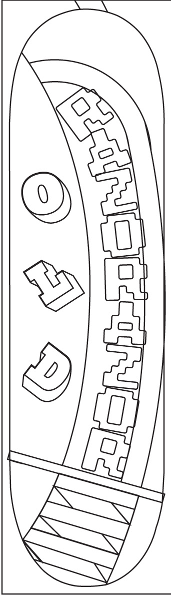
2. This was an idea to put on the top of the board. I wanted to try some sort of double imagery where the letters for old formed the parts of the old samurai's face, but I ultimately abandoned it.
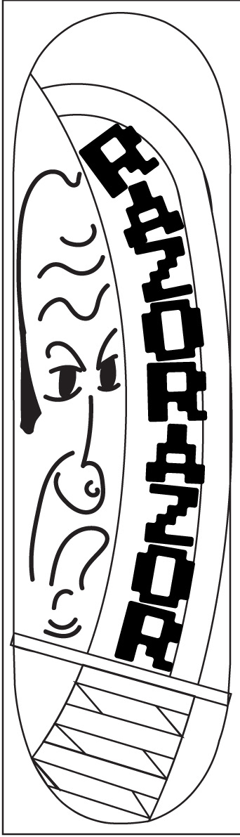
3. Drew in the old man and made the letters filled to stand out more. I really liked the LoRes 9 Plus typeface, because it feels as old and rough as the old samurai!
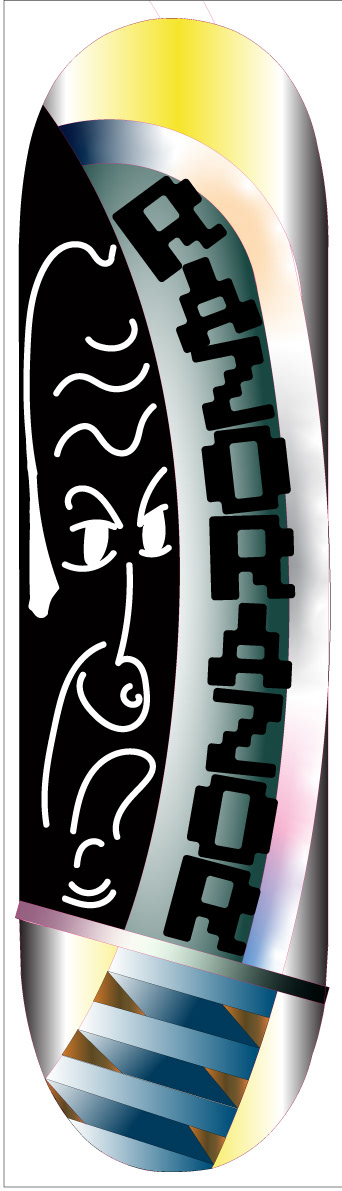
4. Threw in some funky gradients and inverted the old man's color. Seeing it all in color made me want to change a few things. The old man could have less of a steely stare... I want him to be grumpy but not necessarily disapproving. Also, the Razorazor letters didn't look good as text on the thick part of the sword. They would look better if they were the Hamon itself.
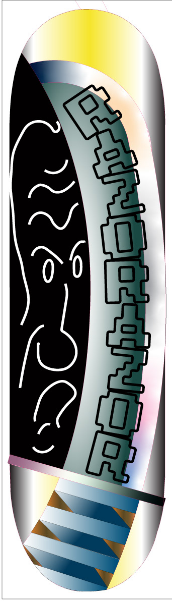
5. Old man has been simplified. Razorazor letters are now unfilled, and I messed with the spacing so that they would look make an interesting pattern for the edge with some nice peaks and valleys.
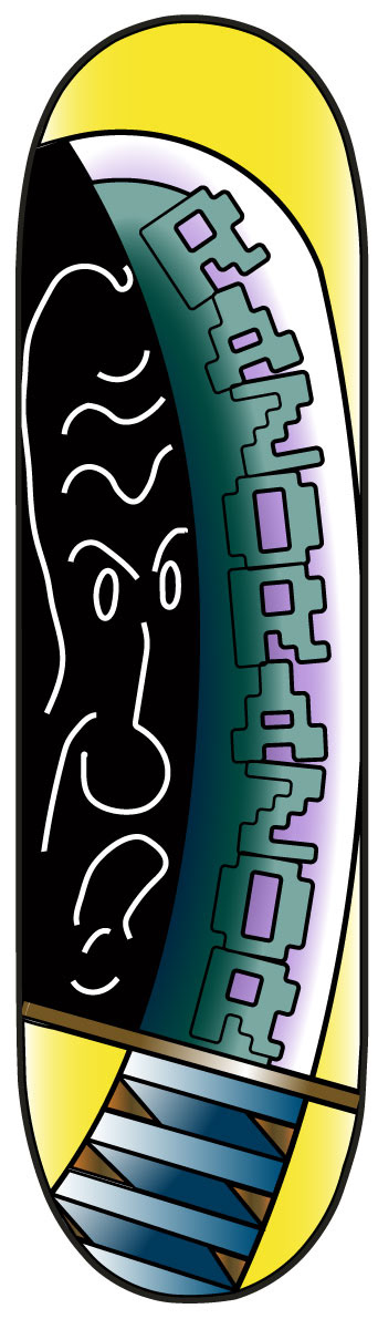
6. Settled on the final, less funky gradients and got the Hamon letter knockouts looking like I want them to. Keeping just the outer edge of the letters looked interesting but I wanted them to still be readable, so I abandoned that idea. The whole thing looks a bit too neat now, so I want to play with interesting strokes to give it more of a brushed and scratched look. A bit more Japanese perhaps?
7. Finally! This look was achieved after liberal applications of brushes from the Hand Drawn Brush and Dry Brush sets. I used Scroll Pen brushes on his eyes to make them BURROW INTO YOUR SOUL.
2. This was an idea to put on the top of the board. I wanted to try some sort of double imagery where the letters for old formed the parts of the old samurai's face, but I ultimately abandoned it.
3. Drew in the old man and made the letters filled to stand out more. I really liked the LoRes 9 Plus typeface, because it feels as old and rough as the old samurai!
4. Threw in some funky gradients and inverted the old man's color. Seeing it all in color made me want to change a few things. The old man could have less of a steely stare... I want him to be grumpy but not necessarily disapproving. Also, the Razorazor letters didn't look good as text on the thick part of the sword. They would look better if they were the Hamon itself.
5. Old man has been simplified. Razorazor letters are now unfilled, and I messed with the spacing so that they would look make an interesting pattern for the edge with some nice peaks and valleys.
6. Settled on the final, less funky gradients and got the Hamon letter knockouts looking like I want them to. Keeping just the outer edge of the letters looked interesting but I wanted them to still be readable, so I abandoned that idea. The whole thing looks a bit too neat now, so I want to play with interesting strokes to give it more of a brushed and scratched look. A bit more Japanese perhaps?
7. Finally! This look was achieved after liberal applications of brushes from the Hand Drawn Brush and Dry Brush sets. I used Scroll Pen brushes on his eyes to make them BURROW INTO YOUR SOUL.